Christian Heilmann

You are currently browsing the archives for the Common Issues category.

Archive for the ‘Common Issues’ Category

Behind the mirror – usability testing musings (day one)

Thursday, January 25th, 2007

I spent the day today in some usability testing of a product I am involved in at the moment. We sat in a small room with coffee, soft drinks and far too many chocolately nibbles and watched people through a one-way mirror remark on our wireframes and try to solve tasks given to them.

I’ve done this in the past, but had a bit of a break in between, so it was fun coming back to it. The most interesting part is that in the year or so I have been out of that loop not much changed.

Test subjects are still very much confused and driven by page copy.

There is somehow no way you can win this. If you use Lorem Ipsum the testers asked what language that is and why it was allowed there. If you use copy nicked from other sites or made-up by a copywriter user names or headlines make testers judge the site by this and don’t see it as just a demo of what can be done.

Everybody is a designer.

Even when it is obvious that this boxed grey monstrosity is not the final page, you get lots of feedback about font sizes, image sizes, and even the look and feel of a map although you kept them deliberately the bog-standard Google or Yahoo maps

It is easy to kill functionality with copy that makes assumptions about how tech-savvy the user is.

My favourite example is “People tagged this with� and “add a tag�. The functionality of tags – being able to give something a memorable keyword that allows you to find this again – is appealing to a lot of users, but the term “tag� just does not wash yet. A lot of users get confused about it and discard this functionality instead of seeing it as a benefit. The danger of that is that it becomes an assumption for webdesigners that way. “People don’t use tags� in reality should be “people don’t know tags if we don’t make them understandable to humans who are not ‘web-savvy’�.

Don’t show your colours prematurely.

Brand perception is a very powerful thing. Concepts that were alien to testers magically become very useful and interesting once you tell them who is behind the product. This messes terribly with your test results. My favourite example is Maggi, the German OXO, a company that produces spice-mixes, instant soups and sauces trying to start a range of sweets. They produced chocolate that was the same quality as competitors like Milka or Lindt, and branded it with their name. Nearly every test subject liked the chocolate but complained about “a slight aftertaste of herbs�.

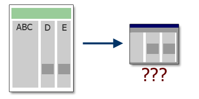
Think about the viewport, not about the whole layout.

Our wireframe was a three column layout that sorted different content into columns but without a strong visual separation between them. On the whole page there was no confusion at all but as two headlines of separate columns with totally unrelated content ended up on the same horizontal line testers ended up seeing this content juxtaposed in the viewport. This confused them as they started wondering what one thing has to do with the other. Of course, this is something that can be solved with proper design, but it was interesting to see how fast people forget what was at the top of the page.

Separations that make a lot of sense in the whole layout may become confusing when you consider that users only see a part of it.

Users know more than you do!

User testing makes you aware of the pros and cons of a product a lot more than any brain-storm, thought-shower, war-room or repeated stand-up session will ever be able to. Things you considered obvious and conventions on the web turn out to be stumbling blocks and things you considered too complex turn out to be a spark for users to come up with ideas how to enhance that functionality in ways you just didn’t think about.

Dear JavaScript Library Developers…

Monday, December 11th, 2006

After spending about three weeks finishing a chapter of the upcoming book introducing JavaScript libraries to non-developers I was quite amazed how tough it is at times to use different libraries.

It was frustrating putting together a set of example scripts for several effects for the oddest reasons, which is why I am now publishing my wishlist for any JavaScript library developers or maintainers. Before you start a new library or expect people to be able to use yours immediately you might want to give these points some thought. For library users this list might be a good “heads up� to see how much work has to go into using a library or how to pick the right library for the job at hand.

Here’s what drove me nuts:

  • Lack of offline documentation. I am writing a lot of code on public transport or in hotel rooms where they consider it still an option to charge me for every 10 minutes online. It is not hard to create a PDF or offer a ZIP of the library documentation even if it is Wiki based.
  • Lack of step by step instructions and examples for effects and elements of the library. Most of the time you either get no examples at all or a single example that shows all the options you have in one script (or a very complex form to play with all of them – which is only marginally better).
  • Lack of unobtrusive examples of code which are those that fall back to working and functioning HTML or HTML+server side script solutions. In the market you will have to develop applications in accordance with accessibility and SEO requirements and both of these require that the page does not rely on JavaScript. It is very easy to create fancy examples that work with JavaScript, but harder to enhance what is already there.
  • There is no problem with trying to improve JavaScript or DOM methods in addition to just fixing bugs and browser inconsistencies. However there is a problem if your extensions break conventions like the event model. I have encountered a library that had addEvent() and removeEvent() methods, but no way to stop the default behaviour of the element. This is an oversight that shows me that this library was never meant to be used unobtrusively or to enhance a server side driven application.
  • Lack of information about browser support and – even more importantly – fixes and updates for new browsers that might come along. This allows your users to update their library includes or subscribe to feeds that tell them about updates and fixes. As a lot of libraries advertise themselves as a helper to make sure you don’t need to know JavaScript this is the least you should do to gain the trust of users. It is easy to claim everything works, but when there are browser specific bugs you cannot expect library users to fix them inside your library.
  • Inconsistency in naming of methods and properties. There is a lot of good documentation on the W3C sites about what an event is, and if you call it action I personally get very confused. If you don’t know JavaScript or the W3C specs that is less of an issue but personally I consider libraries are step towards improving JavaScript and the DOM and not a replacement of them.
  • Trying to replace CSS with library methods. There is a reason why CSS is used for look and feel: CSS parsers are very fast and it is great for maintenance to centralise all look and feel in a spot using one technology. CSS is that technology as it was invented for it. Instead of battling CSS, scripting should piggyback on the CSS parser whenever possible (by adding CSS class names to parent elements) instead of changing a lot of style properties directly. CSS has a lot less options to access content and elements than the DOM has and we can use JavaScript to give CSS developers a helping hand to reach these. There is a reason why there are so many “CSS onlyâ€? solutions out there – people got sick of scanning JavaScripts to find the place to change a look and feel parameter.
  • Don’t play the “mine is smaller than yoursâ€? card. It gives the wrong impression to new developers as they might be tempted to think that your short wrapper methods are all that has to get executed. We all know that they have to be converted to native JavaScript and DOM methods before execution.

Tip: Do not position Google Ads absolutely!

Thursday, November 23rd, 2006

I was amazed to retrieve a cease and desist email from Google Adsense about my ads on this blog the other day. Allegedly I violated their terms and conditions by using advertising in a floating layer (you know the ones that cover dodgy pages before you can use them).

The reason they thought of me that way was that I had a skyscraper ad on the right hand side of this content section positioned absolutely. I also had a JavaScript in place that would hide the whole ad section on browser sizes that are too small to accommodate for it.

However, as the Google compliance testers seem to turn off JavaScript and use a very small browser window when doing their checks, my ads overlapped the content and I became an outlaw.

So remember that when you use AdSense for your web sites don’t position them absolutely but float them or use negative margins instead or else you’d also have to face being banned from the system and get three days to rectify your mistakes.

Needs of the disabled spark inventions – why not in web design?

Wednesday, November 8th, 2006

I just created a presentation for a Tech Talk later on with the topic “Accessibility and You, a non-tech approach to web accessibility” and during the collection of material I realized that a lot of real world inventions were based on the needs of disabled people and are now benefitting everybody.

  • Thomas Edison and Alexander Graham Bell invented the loudspeaker and subsequently the telephone to help Edison overcome his hearing problems, now we all use loudspeakers (sometimes to turn us into someone who is hard-of-hearing)
  • Subtitling and captioning of movies and TV programmes helps deaf users, but also those who are not firm in a foreign language and still want to see the movies as they were intended (I learned a lot by watching Monty Python’s Flying Circus with subtitles)
  • Talking VCRs and universally accessible doors make it a lot easier for both people with disabilities and those without to use them.
  • The University of Manchester is working on some software to make mobile web surfing a lot easier by automatically stripping unnecessary content from web sites. The algorithms and logic of the software is based on research with blind users and screen readers.
  • IBM is working on an alert service for deaf people to get informed when there is a public announcement on stations and airports. When there is an announcement their mobile phones get a message or vibrate, which is something that any visitor could profit from (how many times did you have a delayed flight, went for a coffee and had to neck it because you felt uneasy about not seeing the notice board?)
  • The curb cut, those dips in sidewalks created for people using wheelchairs makes it easier for people with prams, cyclists and others, too.
  • OCR scanning was invented to allow a blind person to hear a text that was previously printed and became a massive success in data entry processes.

These are just some examples, and I’ll be happy to add more (comment please) were a disability became the spark that started a new invention.

However, when you look at any web design list or forum these days, all you hear is “I need to add skip links” or “I need to make this accessible” or “how can I make this work with screen readers?”. Where is the spark there? How come not many people see accessibility as a chance to improve a current product or use it as a test phase to give the product a trial by fire before considering it worthy of publication?

During a summit last month in Germany Markus Erle talked about accessibility testing as an incubator to make products more stable, mature and ready for the real world and not as a means to create a habitat for handicapped users.

This inclusive approach is not new, in fact Wendy Chisholm’s article Innovative Design Inspired by Accessibility on Digital Web covered it already in 2005, but I don’t see it being followed or getting as much time in the limelight as the old “so what do we have to do to accommodate disabled users”?

Thanks to Tomas Caspers and Mike Davies

What makes a good web site?

Saturday, October 14th, 2006

Disclaimer: This is a list that will be part of the upcoming book for Friends of Ed about Web Development with Web Services and APIs. I thought it’d be interesting to preview it here and see what you think.

[link:http://cabanadigital.com/weblog/2006/10/14/%c2%bfque-hace-a-un-buen-sitio-web/#more-173,en español]

Following are some ideas about what makes a successful web site in the web environment these days. Some of this may sound very obvious, but it is a good idea to remind ourselves of the benefits of these ideas.

It is about content.

If you don’t have any interesting content (or content that is also available on hundreds of other sites) you will not reach many people no matter how much you polish the surface of your site.

It is about sharing.

If you put content on the web, it is there for people to see, download and maybe use. You can protect your rights by choosing and displaying a license agreement and copyright information (there is a great “create your own license” tool available at Creative Commons) and there is simply no sense in trying technical tricks to prevent people from downloading your images or copying your texts. When you develop sites these days, you will use a lot of content and programs other people developed. It is only fair to return the favor.

Without people sharing their tools and content for free the web would have never grown as big and exciting as it is now.

It is about access.

If your content is made available to everyone on the web regardless of ability and technical environment you are much more likely to be found and talked about than when you try to block out groups of users or expect a defined technical environment. Your computer is not a representation of everyone on the web and you simply cannot expect people to get a larger monitor, faster computer or install certain browsers or plugins just to access your site. If your content is interesting enough, they may, but I wouldn’t count on it.

It is about communication.

Allow people to communicate with you. Let them comment on your information and offer them easy ways to connect to you. Offer your information in easy to syndicate formats (like RSS) and contact and link to other sites with similar information. This may sound counterproductive – after all, why should you send them visitors you want to keep – but these other sites are likely to link to you as well. The more sites link to you, the higher you will climb in search engine results.

It is about availability.

This may sound paradox but spreading your content on the web and different sites may be a much more efficient way to make it available than keeping it on one server. Of course you need to use the right sites to do so. We live in exciting web times where you can upload your photos to flickr and connect to other picture enthusiasts, upload videos to youtube , share links at del.icio.us and documents at writely.

All of these sites are backed up by large corporations with good servers and even if your site is down for a day, they’ll still be out there. Advertising your site as the source of these bits of data on the other sites will drive people back to it and you can use the APIs they offer to easily include the data in your site.

It is about patience.

As with anything that is really good, you need to spend some time on a great web site.

You will not skyrocket the search engine results in the first few weeks (sometimes even months). Don’t get discouraged by that, instead try to increase your communication with other people in your area of interest – they will link you and you will show up in the Googles and Yahoos of this world.

Having a web site also means that you will get a lot of feedback that is annoying or plain rude. Don’t dwell on that, but pick out information that may be related to real issues and solve these instead. However, it is your site, and there will always be people who don’t like what you have to say or offer – no need to please everybody.

It is about knowing your audience.

Your assumptions of how a web site in your area of expertise should look like might be totally off the mark. Ask people who are interested what they expect, or ask them what they hate about other sites that offer similar content.

It is about playing to your strengths.

If you are not good with words, don’t try too hard but stick to information and what excites you about the subject your site covers. You can also get help from someone close who can put your ideas into words. The same applies if you are good with words but bad with design or structuring information. Don’t try to tackle everything yourself, but instead get some peer review and input to make the end product talk for itself.

It is about offering instead of pushing.

Don’t force anything on your visitors. Videos and Music should not start unless the visitor chose to start them. In addition, offer them as downloads. If you link to PDFs or other media formats, say so in the link as a lot of people will choose to download these instead of reading them in the browser.

It is about keeping it simple.

Don’t try to overcomplicate anything on your web site. Make it obvious what the menu is and what is available. Make it easy to search the site and to contact you. Make it obvious who is behind the site and what the purpose of the site is. Be honest about yourself and people will like you for it. There are far too many one-man-show web sites trying to appear as a whole corporation or network on the web already.

Read your content over and over again – any word that can be omitted or any sentence that could be phrased easier is a win. People on the web are busy and not all of them are native speakers of your language. Don’t make it hard for them.

Furthermore, the web is a secondary media. People do other things while reading your site and don’t take all the content in – instead they scan for interesting words. Steve Krug explains this in How we really use the Web.

It is about advertising without annoying.

Make sure you pick an easy to remember URL and advertise it. With this we don’t mean buying advertising space, but doing simple things like adding the URL to your email footer, stationary or other promotional material. Footers reach further than you may think if you participate on forums and mailing lists.

[update]

It is about freshness.

A web site that doesn’t change at all needs to have amazing content or it will not get any visitors in the long term. It is crucial that you get initial visitors, but also oimportant to keep them coming back, talk about your offers and attract new visitors. Update often and with good content and people will come back. If you use a blogging system as your CMS updates also mean that the RSS feeds change and subscribers get automatically notified.