New blog design – I let the browser do most of the work…
Tuesday, August 23rd, 2016 at 7:12 pmUnless you are reading the RSS feed or the AMP version of this blog, you’ll see that some things changed here. Last week I spent an hour redesigning this blog from scrarch. No, I didn’t move to another platform (WordPress does the job for me so far), but I fixed a few issues that annoyed me.
So now this blog is fully responsive, has no dependencies on any CSS frameworks or scripts and should render much nicer on mobile devices where a lot of my readers are.
It all started with my finding Dan Klammers Bytesize Icons – the icons which are now visible in the navigation on top if your screen is wide enough to allow for them. I loved their simplicity and that I could embed them, thus having a visual menu that doesn’t need any extra HTTP overhead. So I copied and pasted, coloured in the lines and that was that.
The next thing that inspired me incredibly was the trick to use a font-size of 1em + 1vw on the body of the document to ensure a readable text regardless of the resolution. It was one of the goodies in Heydon Pickering’s On writing less damn code post. He attributed this trick to Vasilis who of course is too nice and told the whole attribution story himself.
Next was creating the menu. For this, I used the power of flexbox and a single media query to ensure that my logo stays but the text links wrap into a few lines next to it. You can play with the code on JSBin.
The full CSS of the blog is now about 340 lines of code and has no dependency on any libraries or frameworks. There is no JavaScript except for ads.
The rest was tweaking some font sizes and colours and adding some enhancements like skip links to jump over the navigation. These are visible when you tab into the document, which seems a good enough solution seeing that we do not have a huge navigation as it is.
Other small fixes:
- The code display on older posts is now fixed. I used an older plugin not compatible with the current one in the past. The fix was to write yet another plugin to un-do what the old one needed and giving it the proper HTML structure.
- I switched the ad to a responsive one, so there should be no problems with this breaking the layout. Go on, test it out, click it a few hundred times to give it a thorough test.
- I’ve stopped fixed image sizes for quite a while now and used 100% as width. With this new layout I also gave them a max width to avoid wasted space and massive blurring.
- For videos I will now start using Embed responsively not to break the layout either.
All in all this was the work of an hour, live in my browser and without any staging. This is a blog, it is here for words, not to do amazing feats of code.
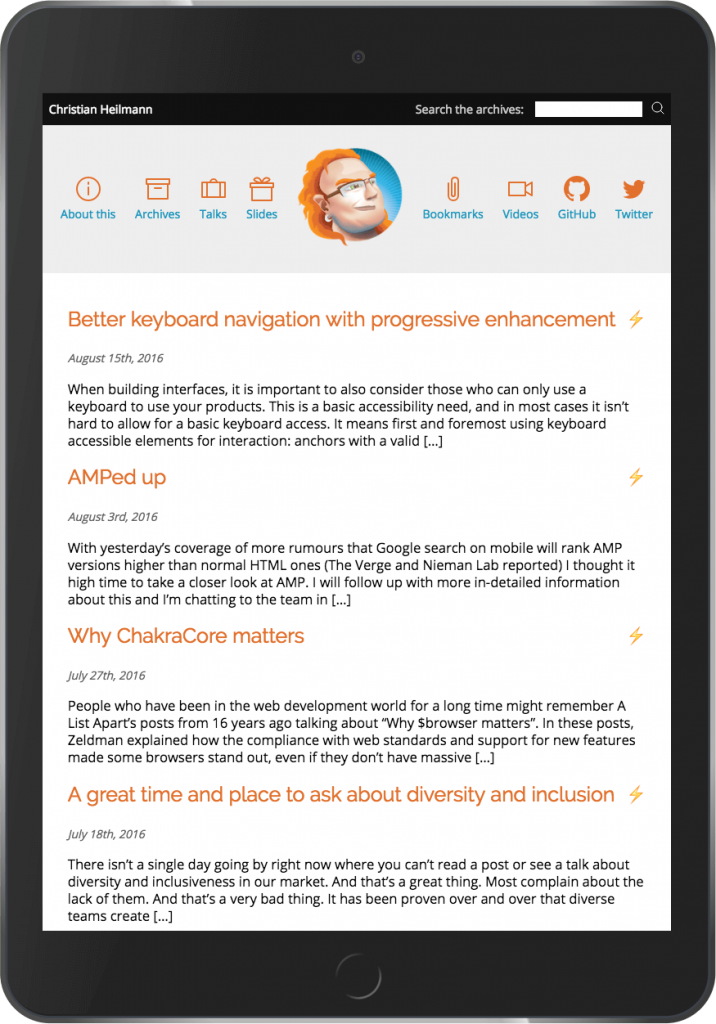
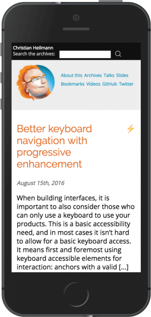
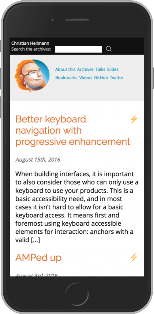
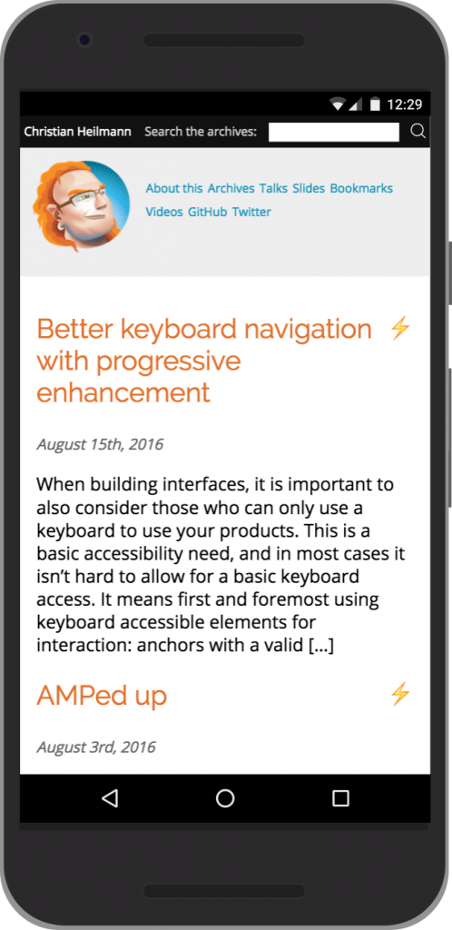
Here are few views of the blog on different devices (courtesy of the Chrome Devtools):
iPad:
iPhone 5:
iPhone 6:
Nexus 5:
Hope you like it.
All in all I love working on the web these days. Our CSS toys are incredibly powerful, browsers are much more reliable and the insights you get and tweaks you can do in developer tools are amazing. When I think back when I did the first layout here in 2006, I probably wouldn’t go through these pains nowadays. Create some good stuff, just do as much as is needed.